
Industry
UK mortgage brokers, advisers and advisory firms.
Case Study — Product Build
A repayment calculator built for UK mortgage brokers and fitted to their own site. The visitor sets the property price, the deposit and the term themselves, and their own monthly payment appears as they drag — so the question that sends people to a bank’s website gets answered on the broker’s instead.
Try the live calculator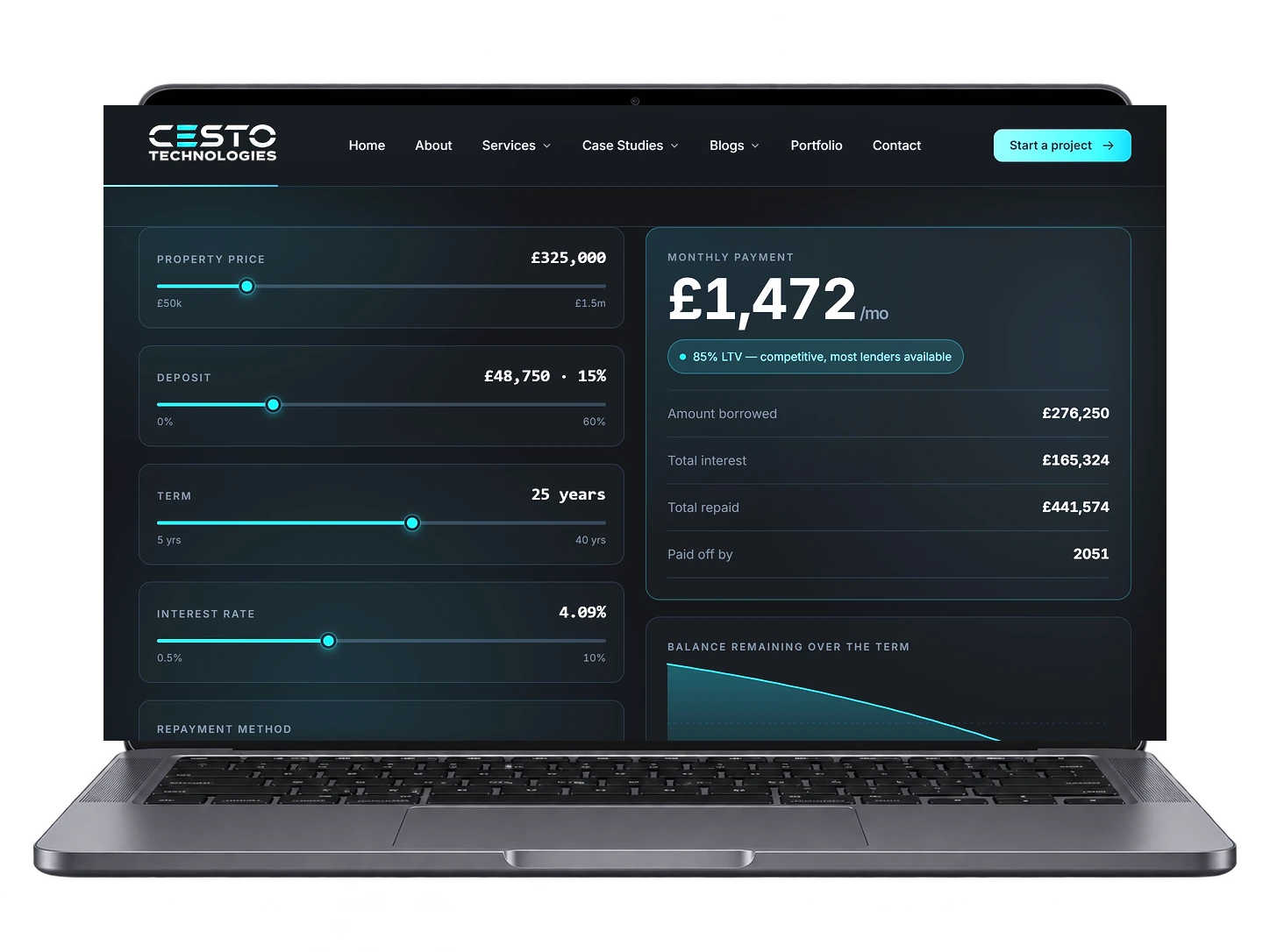
cestotechnologies.com
This is our own product rather than a single client’s project. Mortgage firms tend to have a website that explains what they do and a Google listing that brings people to it — and nothing on the page that answers the first question anybody actually has. So we built the missing piece once, properly, and fit it to each broker’s branding rather than rebuilding it every time.
UK mortgage brokers, advisers and advisory firms.
Design and build of a reusable calculator component.
Keeping the visitor on the broker’s page.
Somebody lands on a broker’s website wanting to know one thing: what would this cost me each month? If the site cannot tell them, they go and find out on a bank’s — and that is where the rest of the journey happens.
The visitor leaves to get a number the broker could have given them, and the rest of the decision happens on somebody else’s page.
Most calculators are a form with a Calculate button, which turns a two-second question into a task — and tasks get abandoned.
Asking for an email address before showing a figure reads as a trade rather than a service, and it costs trust at exactly the wrong moment.
Almost none of them model what happens if rates move, which is the thing people are most anxious about and most want to explore.
Everything recalculates on every input. There is no Calculate button, because a button is a decision and dragging a slider is not — the figure simply follows the visitor’s hand. Four controls cover the whole question: property price, deposit, term and rate, with a capital-and-interest or interest-only switch underneath.
The deposit is expressed as a percentage and a cash figure at once, because people think in one and are asked for the other. The loan-to-value updates alongside it with a plain-English note on what that band means for lender choice. And under the headline figure sits the part brokers tell us visitors actually play with: what the payment becomes if rates rise by one, two or three points.
The headline figure, recalculated on every drag. It is the largest thing on the page because it is the only reason the visitor is there.
What the payment becomes at plus one, two and three points, with the difference shown alongside. The honest counterweight to a single reassuring number.
The loan-to-value, plus a plain sentence on what that band tends to mean for lender choice — not a promise about any particular rate.
A chart of what is still owed, year by year. It makes the shape of a repayment mortgage obvious in a way a table never does.
A single switch, with the totals and the chart both responding — useful for buy-to-let enquiries as well as residential.
Colours, type and spacing follow the host site. It should look like part of the broker’s website, not like a widget someone embedded.
Most of these searches happen on a phone, so on a narrow screen the result panel is ordered above the controls — the monthly figure is why the visitor opened the page, and it should not sit below a screenful of sliders. The sliders themselves are full-width with large targets, and the track fills as it moves so the control reads as a gauge rather than a form field.
Every figure uses tabular numerals, so the digits do not jump sideways as they change while dragging. The controls are real range inputs, which means they work with a keyboard and with a screen reader rather than only with a mouse.
There is no plugin, no third-party script and no external request — the arithmetic runs in the visitor’s browser, so nothing is sent anywhere and there is nothing to slow the page down or break when somebody else’s service goes offline.
It also states plainly that it is an illustration rather than a quote, and that lenders stress-test affordability at a higher rate than the one shown. That matters more than it sounds: these are FCA-regulated firms, and a calculator that implied a guaranteed figure would be the one thing on their site capable of causing them a problem. Saying so is what makes it safe for a broker to put their name on.
The reason to leave for a bank’s website is removed. Whatever happens next happens on the broker’s site.
People try several combinations — a bigger deposit, a longer term, a higher rate. Each one is another minute on the page.
Somebody who has just worked out their own payment is further along than somebody who has read a page about mortgages.
We make no claim about rankings, leads or sales here, and nor should anyone — what a tool does to enquiry volume depends on the traffic a site already has and the market it sits in. The honest claim is narrower: the question gets answered where the visitor already is.
The demo is live and takes no details. Have a look at what it does, and if it suits your firm we will fit it to your site and branding.